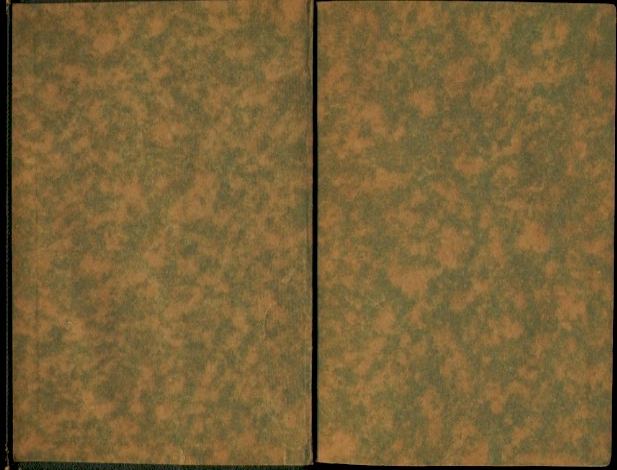
Marbled
1917-1919 (Toledano binding type 1)Came in brown, blue, green, and teal.
Books of this period also had plain end papers in white, tan, brown, and robin's egg blue.
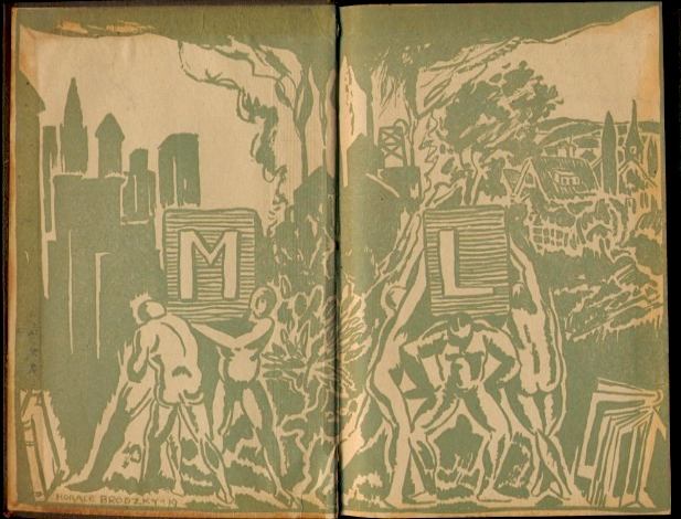
Horace Brodzky, designer
1919-1925 (Toledano binding types 2 & 3 plus the occasional 4)Came only in green on tan background.
Brodzky's design was used as a result of a contest that Boni & Liveright ran, offering $100 to the artist submitting the best end paper design "interpreting the spirit and character of the Modern Library." (Publisher's Weekly, 03/08/1919)
The last title to use the Brodzky end papers was the first printing of Beebe's Jungle Peace in a Toledano 4 binding with the Bernhard torchbearer (Spring 1925). This was also the very first title to be published in the new Modern Library company under the ownership of Cerf and Klopfer.
We also have a report of a Mikado & Other Plays in the same 4 binding with Brodzky endpaper and Spring 1925 B-L DJ.
Brodzky also designed a shortlived frontispiece (the illustration facing the title page) and title page design. Click here for the details.
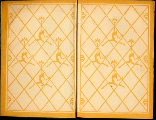
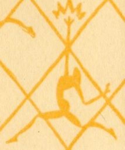
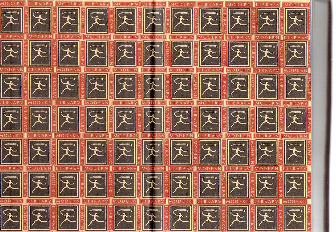
Lucien Bernhard, designer
1925-1929 (Toledano binding types 4, early 5)Came only in orange.
Just after Cerf and Klopfer bought the 108-title ML collection from Horace Liveright in 1925, they commissioned the German posterist and typeface designer Lucien Bernhard to design a new colophon - the Flying Torchbearer, representing the light of knowledge. The colophon was used as the basic motif for the new end papers.
1925 saw the first year that ML titles displayed its iconic running torchbearer image (although the first title, Beebe's Jungle Peace, used Brodzky end papers for the first printing).
The first title to use these end papers was Dumas' Camille (Fall, 1925).
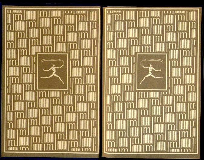
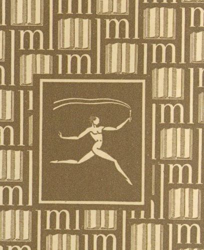
Rockwell Kent, designer
1929 - Spring1967 (Toledano binding types 5 through 11)
Came in orange, dark gray, light gray, tan, green.
In 1929, Rockwell Kent was brought in to design new colophons and end papers. He continued to design variations for the next ten years, all based on the Bernhard. (Don't miss the special end papers Kent designed for his own book, Wilderness, shown later on this page.)
Petronius' Satyricon was the first title in the series to use Kent endpapers (Summer, 1929).
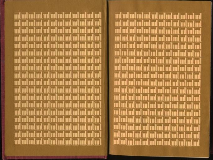
Sadamitsu Neil Fujita, designer
1967-1970+ (Toledano binding types 12 through 14)
Came in orange, brown, blue, green, lavender.
Some books of this period also came with plain white end papers.
1982 - 1986
Used with the 16 binding style.
Giants
1947 (Fall) - 1950 (Spring)
Barry Neavill sez: "The first Giant to use the end paper was G72 Great Tales of Terror and the Supernatural; the last was G74 St. Augustine's City of God."
Except for this brief period (and a couple of special editions noted below), giants had blank end papers. Some giants had an imprint claiming that the volume sported Kent endpapers, but the imprint was a misplaced boilerplate. No Giant ever had Kent endpapers.
1982 - 1986
Used with the G9 binding style.
Click an image for a full-sized example, or click a noted link below an image to see more image details.
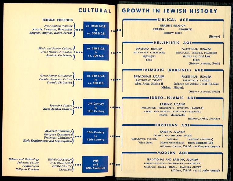
Great Ages & Ideas of the Jewish People
Click here for a fairly large view
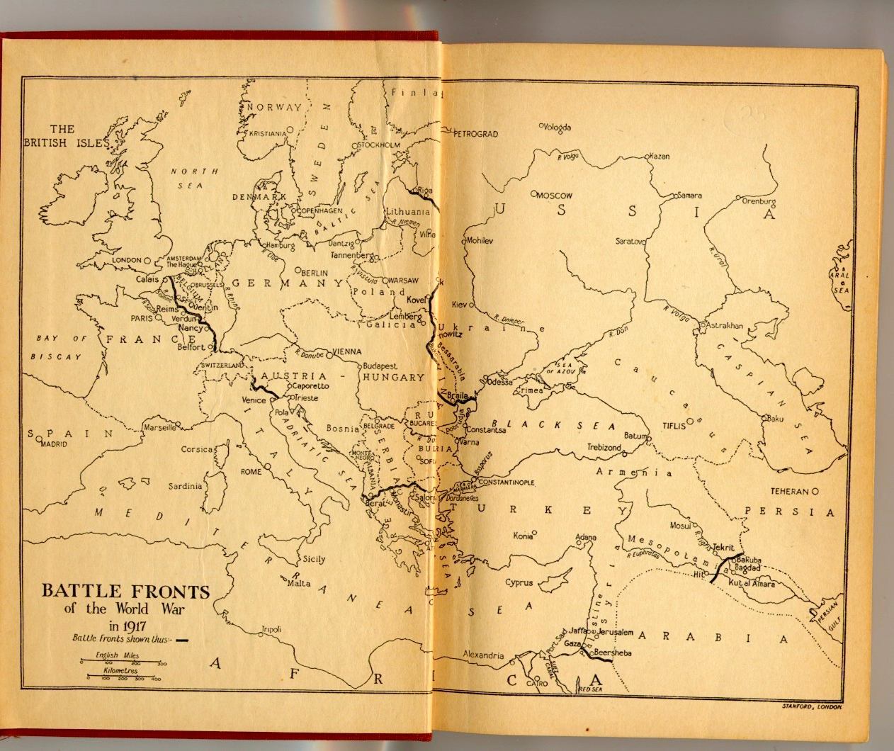
Hart's War in Outline
Top figures detail Bottom figure detail
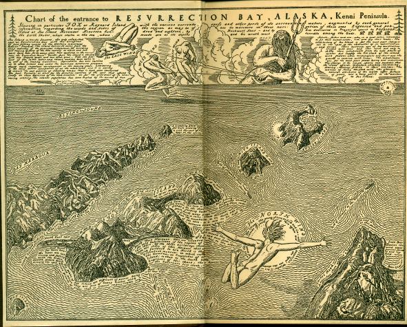
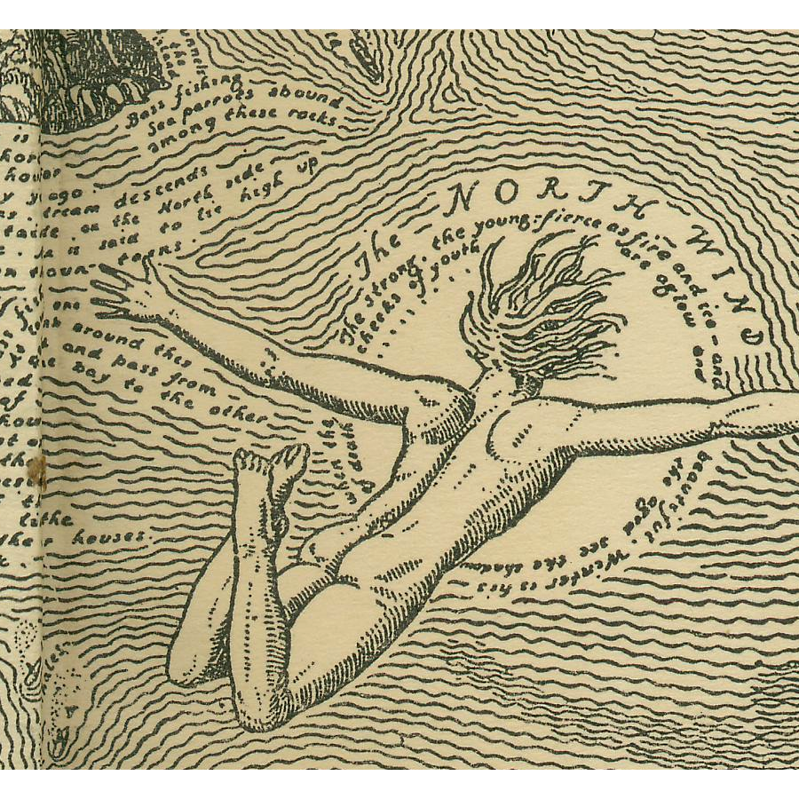
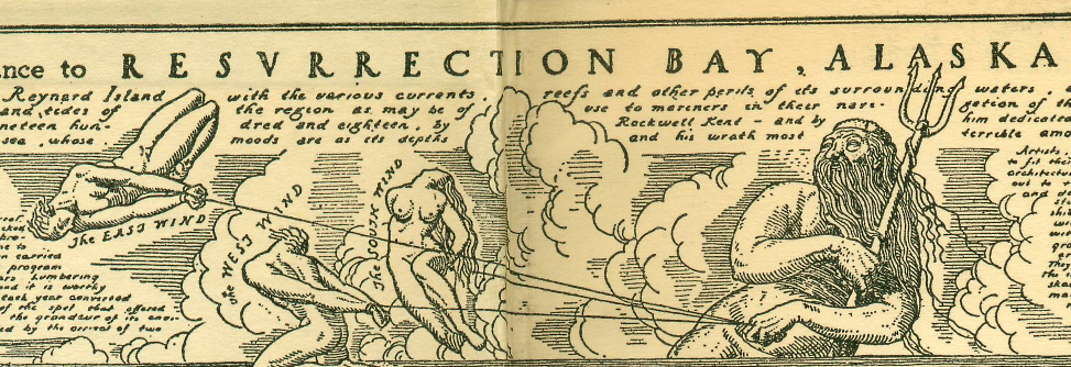
Kent's Wilderness
Paul's Life and Death of a Spanish Town
Twain's Tom Sawyer and Huck Finn